Showing posts with label Shades of Spring. Show all posts

A Canvas Tutorial!

Monday, June 16, 2014

Welcome to today's Frosted Design's Blog Post! Jean here and I have a video showing you a quick and easy canvas that you can make. Don't want to make a canvas? This could easily be made into a card or a layout!

Here is a photo of the finished canvas. As you can see I decided to add a large F and the date. The Forever Red Perfect Pearls Mist  really made them stand out.


There are so many things you can do with this kit! I have made two layouts, this canvas and a card so far! Be sure to share your projects with us on the Facebook page!

And don't forget the store for your mixed media and scrapping needs!!


3 Comments »

The Deconstructed Layout With Anita

Tuesday, June 3, 2014

Good morning everyone!
It's Anita here today to share another installment in my 
Deconstructed Layout Series.


Almost every item on my layout today can be found in the Frosted Designs Store.
Have you been shopping lately?? Barb has some amazing new products in
and I am sure you will love them!!


Today I want to talk a little about perspective. 
I didn't start scrapbooking until my kids were in high school. When they were babies, we didn't have digital cameras, and we didn't even have really great cameras unless you spent a fortune on them. So the majority of the photos I have from those days are not that fantastic. Most of them are not what I would take today, that is for sure! They have distracting backgrounds, they are taken from far away, I never considered the lighting-- I just took pictures. And because technology was not that great, even scanning them is not an option sometimes- they are too grainy when enlarged. The only option is to scrap them as is

So, I only have this one little photo of my precious baby on her first bike with the training wheels. Now, I was able to scan this one in and do a little editing to it; there was a HUGE trashcan right behind her head- really- it looked like it was growing out of her head! So I was able to take that out. But it was too grainy to really blow up so I had to leave it pretty much the same size. 

Now, if this was a digital photo, we would just hit delete and move on. But, this is the only one I have. So my choices are to scrap it like this or do without.  In the end, I want to scrap these memories, so I'm using these photos even if they are not great. Such is life. 

There are a few tricks you can use to make a photo "pop". 

#1. Layering the photo up off the page will help the eye focus on the photo before it gets to the embellishments. For this I used a chipboard frame. Normally we would put the chipboard frame on TOP of the photos, but in this instance that was the opposite of what I wanted. As you can see above, when the photo is below the chipboard your eye focuses on the chipboard first, the photo second. When you put the photo on top of the chipboard, the eye naturally focuses on the photo first, which is what we want.

 #2. I used stickers strategically on my photo to call attention to my daughter- because she is not very big in the photo itself. If I cropped all the excess out of the photo that would leave a photo that was about 1 X 2- not nearly big enough for a layout. 

#3. I used a limited palette so I wouldn't overwhelm the eye. Even though there is color on the page, nothing really stands out. I used 3 colors of embossing powder on the chipboard frame, but it almost blends into the black background- leaving the photo floating up there on top. 

If you have photos you have not yet scrapped because they are not "perfect" - it is time to get them out. There are so many ways to get those photos onto layouts. After all, it is about the memories, not a perfect photo. 

Thanks for stopping by today!


4 Comments »

Can't get enough of Simply Sweet!

Wednesday, May 28, 2014

.Simply Sweet

This month I have had so much fun playing with my Simply Sweet May Kit that I have done a few more extra projects and still have some of the kit left, they really are amazing with so much included!


For my first project I did a canvas, using the The Crafters Workshop Stencil - Live Love Laugh included with the Messy Kit and Molding Paste to make my designs, and turning the stencil over and reversing the flower for a different look. I added the butterfly in several places as well, I love how you can use part of a mask or redesign your own look by using the mask in different ways.  I also added some molding paste texture using the Tim Holtz Dot Fade stencil included in the February Kit. I took my Autumn Leaves Starburst Spray Set, and sprayed the Tibetan Poppy Teal and Cattail Copper brown on my canvas as a base adding color and bringing out the texture of the molding paste. To highlight the gorgeous flowers and butterflies on my canvas I used my Paradise Pink Glimmer Glaze included in the kit. The butterflies also got a little dot trail following behind them from my Viva Decor Cream Paper Pen.  I added in some inspirational sayings from the Cosmo Cricket Just Because Tiny Text Stickers to my canvas and then finished off my canvas with a bit of stamping using the 7 Dots Cold Country Clear Stamps script stamp and some dark brown inking of the edges using my Prima Knotted Wood Chalk Ink.

For my next project I did a set of three cards using a mix of the Heidi Swapp Dreamy Papers and Melissa Frances The Sweet Life paper, a collection of pastel yumminess!! I used tons of embellishments from the kits to finish them off!


For this first card I used the Melissa Frances papers, layering it up and edging the paper with the Cream Paper Pen. I added stitching to another layer then loads of kit embellishments: Prima Princess Flower, Maya Road Vintage Find Bird and fun buttons from the Dress It Up Embellishments package - Au Jardin Whisper. I added a little sentiment from the Cosmo Cricket Just Because Tiny Text Stickers.


Another fun pastel card using the Melissa France Papers! I stitched around all the paper layer edges, added Prima Princess Flowers, Prima Gillian White Flowers, Heidi Swapp Dreamy Clear Watercolor Words and the Dress It Up Embellishments buttons. I added a bit of twine from my stash.


My final card with lots of zig zag stitching on the layers, Dress It Up Embellishments buttons, Prima Gillian White flowers, Maya Road Crochet Trim and Cosmo Cricket Just Because Tiny Text Stickers.

I really had a lot of fun putting together these cards and the canvas with the May Simply Sweet Kit. There aren't very many left, so I hope that you will run not walk over to the Frosted Designs Store to pick one up for yourself!!


2 Comments »

Celebrating Our Graduate!

Friday, May 2, 2014

Happy Friday everyone! I had a few quite hours where I had the house completely to myself so I took advantage of that and started to play with some of the messy products sitting on my desk! I added in some of the items from Frosted Designs Kits and this is what I created!

Last May my daughter graduated from Evangel University and we couldn't be more proud! Even though the weather wasn't very Spring-like that day, I decided to make a Spring-Like layout!  :)

I had a lot of fun getting a little messy on this one! I started by spraying a little Dylusions Ink (Lemon Zest) on the background paper (which was in the Love is in the Air  kit). I then used my Koi Water Brush along with the Watercolor Crayons to add a little orange to the background. I love the water color look! Finally, I used the stencil (from the November Mixed Media Kit) and some Gelatos to create the blue circles!


The patterned papers I layered behind the photo were from the Shades of Spring Kit. I outlined the edges of the patterned paper and scalloped frame on the photo with the Black Gelly Roll Pen! It is perfect for this! I LOVE the black chevron Trendy Tape from Queen & Co so I added that in a few places! Do you like the Studio Calico polaroid die cut? It is from the Sea Breeze Kit! Don't you love it when you have bits and pieces left from kits that you can use like this?!  :)

Finally I added a few extras down in the corner of the layout! I can't get enough of the Maya Road Vintage Metal Trinkets!


Tomorrow is National Scrapbooking Day! I hope you get some time to play and create! If you need supplies, you might want to check out the Sale going on in the Frosted Designs Store!


4 Comments »

Sundays with Sandee + Frosted Designs Kits = A Brand New Journal!

Friday, April 18, 2014

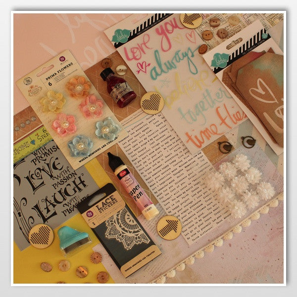
Hello everyone! Barb here to host the blog today! I don't know about you, but I absolutely love our Sundays with Sandee series! The woman never runs out of ideas and I LEARN sooooo much from her! I may not have time to try out every single thing, every single week but I am watching and learning! So… when it was time for me to make a journal, I decided to go review a few lessons and put them to practice! You are actually going to laugh when you see how many I used!! The other thing I used a lot of were the Frosted Designs Kits! I pulled a little out of this one, and a little out of that one, and then something from another one… you get the picture!! Isn't that the best part of getting kits?!

I like to have a little notebook that I take with me to church. This is my place to keep any sermon notes, bible verses or any other important words of wisdom so that I have them all in one place. Once I am home, I can look back over my sermon notes and also use it during my devotion time. That is what this little notebook is being used for.

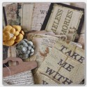
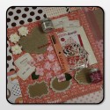
So, here it is! The completed journal cover! I have to confess, this is my second attempt. The first one just wasn't working for me so I started a second one. My only regret on this one is that I didn't take photos each step of the way so you could see the madness to my thinking!! :)


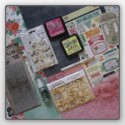
I started with the Mixed Media Journal in the Frosted Designs Store. I love that it is wire bound and has plenty of pages! The size is perfect for fitting into my purse. I used the graph looking paper that was in the 
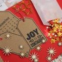
"Love is in the Air" Kit (Clean Fun) and cut it to the size of my journal cover. I did all of my work on the paper before I adhered it to the journal. That way I didn't have to worry about mists and paints getting on the journal where I didn't want it.


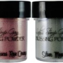
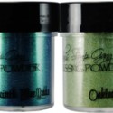
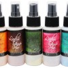
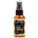
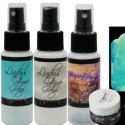
I started by creating the background using Lindy's Starburst Sprays & Sandee's Lesson #3 - Wax on or Wax off! I loved the way it created the soft blue background! But that was not enough! So, the next lesson I used was Lesson #4 - Going Dotty! I added dots with the Lindy's Starburst (using the dauber top), and stencils (from the November Mixed Media Kit & Shades of Spring Kit.) I also used the Tim Holtz Distress Paint Dauber (Juniper) in the 
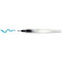
Shades of Spring Kit! The stem of the flower was painted using the Lindy's Magicals that come in our current kit, Beauty of Nature. The Koi water brush was perfect for this!


My next step was to check out Sandee's Lesson #6 - Acrylic Pour and Ink Blots. I didn't actually pour the paint (other than a few splatters) but I liked the way Sandee used the Patterned Paper for her heart. As I was sitting there struggling to figure out what I wanted on the front of my journal (didn't want a cross or a heart) I decided to check out Lesson #8 - Mixing it up! The flower that Sandee had in that lesson inspired me to make the flower but I used patterned paper for mine. The red paper came from the Love is in the Air Kit. I cut out 3 hearts and layered them over each other. I then punched a circle from some paper in the Shades of Spring Kit. I folded the circle in half and used it to hold the "petals" of the flower together! I used the Black Gelly Roll Pen to outline everything.


Next it was time for the title. Everything in me wanted to grab some nice thick stickers to stick on and call it done… but I didn't! Instead, I added a title with the Black Gelly Roll pen and I hated it! It wasn't the handwriting that bothered me as much as it just got lost on the page! So… I grabbed the November Mixed Media Kit and cut out the Journal tag. It was the perfect size to cover up the title I didn't like! :) I then jumped into the next Sandee lesson, #23 - Bar Lettering. I added a few lines on each letter using the Tim Holtz Distress Marker that comes in the Beauty of Nature kit. Inspired by Sandee's Lesson #10 - Cut it Out, I cut the word "take" from the patterned papers in the 
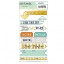
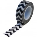
October Mixed Media Kit. The sticker under the title came from that kit as well. The striped tape under "take" is from the Season of Stars Kit. I seriously love that tape… it ends up on many of my projects!

To finish off the cover, I added my favorite Bible verse in my own handwriting. Finally, I adhered the paper to the front of my journal and I was done! I am happy with the way the journal turned out and I am even more happy that I ventured outside my comfort zone to create it. That is also one of the things I am enjoying with the Frosted Designs kits… trying out all kinds of mixed media items and techniques! I am so thankful for all of the Sundays with Sandee Lessons that were available for me to learn from and the nudging from Lori (Telling Your Story Through Scrapbooking) to add handwriting to all of our projects!

I'm sorry my post was so long today but I hope it inspires other to get outside their box to try something new! I would love to see what you make! You can share it in our Facebook Group…. there are a lot of amazing ladies who hang out there and are super supportive! Have a great weekend!

*Did you know that you can get one of our 2013 kits for FREE when you sign up for a subscription! Just leave a note a checkout stating which kit you would like! If you have questions, send an email to barb@frosted-designs.com!


7 Comments »