Showing posts with label December MM Paper Kit. Show all posts

Pick of the Patch with Lori!

Monday, October 27, 2014

I just love fall - it is my favorite time of the year!  We went to the Pumpkin Patch last week and my friend captured this picture of Tanner picking his pumpkin.  I wanted to showcase this photo all by itself so I grabbed papers from the Garden of Abundance kit. 

I realy like the colors in the flowered paper - they look similar to the brown and green in the pumpkin patch.
I needed a pinch of orange so I grabbed an orange gelato and colored around my photo mat and title mat.  I spritzed my paper towel with water and blended the orange around the edge of the paper.
I used my Silhouette Cameo to design and cut the tree, pumpkin border and title.  I just love that tree! 
I inked the pumpkins a bit with some moss green ink and then spritzed them with Heidi Swapp gold color shine. 
Look at that gold on these pumpkins - just gorgeous!!  I cut some of the pumpkins off the border and pop-dotted them on the page.
I added the wood heart to the tree trunk and a bird in the branches.

Enjoy your fall and don't forget to create and share your stories!!


 photo Lori_zpsea64f050.jpg

3 Comments »

The Deconstructed Layout with Anita!

Wednesday, September 3, 2014

Hi everyone, it's Anita here today and  I have another installment in my Deconstructed Layout series to share with you

For my project I am using the fabulous Summer's End kit from Frosted Designs
 

Today's Deconstructed Layout is about using repeating patterns and colors. I really wanted my photo on this layout to stand out, but I still wanted to be able to use a fair amount of detail and embellishments on the page. 
In order to do this, I kept the colors to a minimum and repeated the same shapes over and over. 


Here's a look at my layout
My goal was to have lots of detail on the page, but make it blend into the background and let the photo shine in front. 
To make this happen, I 
1. repeated the same basic shape of the KRAFT DOILY from the kit several times.
*doilies
*stenciled background
*brads
*flowers
2. I REPEATED the pattern of the KRAFT DOILY on the edge of my punched strip
3. I picked a color from the photo (Golden Yellow)and went several shades lighter for the color of my embellishments/background

The Petaloo flowers included in the Summer's End kit were perfect, and I used a  We R paper from the kit to mat my photo.The Gold dots are from the December Mixed Media Kit, and the metal piece is from the Summer's End. 


This is the same cardstock I used to mat my photo with, I punched both edges and added a strip of glitter down the center. The die cut stickers is also included in the Summer's End kit.


On the kraft doily I inked the edges and added some faux stitching- and I cut them in half before I tucked them under the photo mat. Now, I still have 3 to use again on another project. I stamped here with Elle's Studio stamps and the brad is from the Capture the Moment's kit. 


I loved the resin accents from the kit, so to make them blend in I used the same ink on them as I used else where and buffed with a dry cloth. I added some ribbon and more pearls here. 


Thanks so much for stopping by today. 
I hope you have enjoyed this installment of my Deconstructed Layout series! 


4 Comments »

Creating Balance and Using Math!

Thursday, February 6, 2014


Hello ~ Lori here with another Telling Your Story With Lori scrapbook technique.

Last month, my post was about Balance ~ How to create balance in your layout.  This month, I will show you how to use Math to create balance.  Math???  Yes Math.  I never realized how much I would use Math after high school and college!!

As in anything important (school, sports, work, scrapbooking) a good foundation is the key to success.  I find that Math helps me with my scrapbook foundation.

Let's get our tools and get started:
I start with a ruler (or two), my paper cutter, my mat with a 1" grid and my scissors.  Most of the time I start my layout with my photos.  I want my photos to be the main focus of each layout because without photos - why create a scrapbook page?

The first thing I do is determine if I am going to mat my photos or not.  The second thing is what color will I use.  Because these photos are pretty busy, I chose black for my photo mats.

Our mayor came to Tanner's school Friday.  The second graders just finished a unit on community and had a class election the week before.  One of the teachers took some pictures of his presentation on her cell phone.  When I printed the pictures out, the 4" x 6" photo was not actually 4 "x 6". 
As you can see here, the length is 5 3/8".  In order to get a perfect 1/8" mat for my photo, I added 1/4" to both sides. 
I trimmed my mat to 4 1/4" x 5 5/8".

Sometimes, we can't fit all of the pictures on our page the way they are, so we trim them down. My go-to trim is 4" x 4". 
In order to see where to make the cuts to create a 4" x 4" photo, I put the photo on my paper trimmer.  For today, I used some scrap black paper so you can better see the cut lines.  I wanted to leave a tiny bit above the mayor's head as long as it did not cut off too much of the children's legs.

I put one black strip where the cut line is and the other at the 4" mark. 
I trimmed off the top and then turned the photo upside down and measured to 4 inches and trimmed the bottom.

I also trimmed the mat to 4 1/4" x 4 1/4".  I trimmed a mat for the 5" x 7" photo to 5 1/4" x 7 1/4" and set both photos and mats aside. 
Back to balancing the layout - you can divide your paper into thirds for photo and background paper placement.  The first example I have is horizontal.  This gives you a guideline.  I know that 1/3 of 12" is 4" so I cut two 4" x 12" strips to demonstrate. 
The second example is vertical. 
The third example is both! 
One more example is to divide the paper in half - so I cut a piece of 6" x 12" piece of black scrapbook paper to give you a visual.  This can be horizontal or vertical as well.

For my layout today, I chose the horizontal thirds option (my first example). 
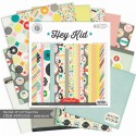
I used a piece of paper from Hey Kids as my background paper.  I cut the red chevron paper from the December kit to 4" x 12".  I placed the chevron paper in place and set my photos on top. 
I wanted to put the title under the large photo but not hanging down below the small photo.  I took out my ruler and measured the area.  When I designed the title on my Cameo, I made sure it was sized within 5 1/2" x 2".

I also needed a journaling spot.  I measured and area 2 1/2" x 3" and trimmed some scrap paper to fit the size.

At this point, nothing is glued down.  I removed everything from my paper and grabbed my fun supplies!!! 
I spritzed my paper with Cherry Pie Dylusions Ink and Teal Heidi Swapp Color shine.  In this photo you can see I spritzed the chevron paper too.

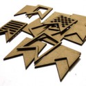
I cut my title and election arrow tabs on my Cameo. 
My title fit perfectly in the space below the large photo.  I chose this title because the Mayor picked 8 students (including Tanner second from the left) to represent the City Council. 
I attached part of an arrow tab and stapled it to my journaling tag.  One of these months we will explore handwriting and why it is so important!! 
Under the small photo, I created a banner look to mimic the arrow tabs.  I colored the wood pieces black with my Farber-Castell PITT artist pen big brush.  I trimmed two flag pieces of cardstock leftover from my cameo cuts to create a dark red flag.
Here is my completed layout done without a sketch this time, just with my Math skills!!  As you look at this layout - where does you eye go first.  I hope it goes to one of the photos!!

Until next time,
                                      photo Lori_zps2a01ac7d.jpg


3 Comments »

Telling Your Story with Lori!

Thursday, January 9, 2014


I am Lori Apgar and I am going to help guide you on how to Tell Your Story Through Scrapbooking.  I taught Scrapbook Design and You (SDU) classes at Michaels and got my certification through EK Success (now called Spotted Canary).  SDU is a four week class, but here at Frosted Designs, I plan to give you condensed “shots in the arm” versions each month to help you create your story on paper. 


Today I am going to focus on BALANCE.  Balance happens to be my One Little Word for 2014 so I thought it would be a good place to start.

Balance means different things in scrapbook layouts.  It can be difficult to find the balance between pictures and titles (sizing), or the balance between having too many pretties (embellishements) or not enough, or even the balance of how much time you are spending to make it a "perfect" layout compared to how much time you can spend scrapbooking.  

Balance can also help you put everything together so it looks pleasing to the eye.  Most people spend 5-10 seconds looking at scrapbook layout in an album - you want to find a way to keep their attention and have them notice the most important part - the photos!!

We are going to focus on balancing our pictures and titles within a layout.  My go-to title used to be 2"x12" which is a 1/6 of the page!!  On some layouts that works just fine.  I had to look at what I wanted the title to represent - a headline, or a one-word POP or something in between.
For my layout today, I am scrapping my son's Winter Party at school.  He begged for a snowball fight - so I wanted to use that as the title.  I had 3 photos, but picked the best two because they were all similar and very busy photos.  I wanted to keep the layout pretty simple so it did not compete with the photos.
I found a sketch to use (which is optional but sometimes helps).  The title is small on the sketch, but I don't always follow the sketch exactly so I came up with some different versions to see what looked the most balanced to me.


I used my cameo to create these visuals for you and I added my supplies.   As much as I like the bigger title, I think the medium title looks best (like in the sketch).   While all three sketches are good, the first two options have too much white space and don't hold my interest as long as the third option.  As you can see, there are no WRONG answers in scrapbooking - just guidelines!

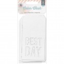
I really wanted to use the tag Best Day because that is how Tanner described the party.


 I used some Heidi Swapp ink to mist the tag and snowflakes as well as a piece of watercolor paper.  As you can see above, the Best Day is larger than my title and does not look balanced - it looks like I have two competing titles - so I took it off.


Instead I used the top side of the tag and wrote my journaling on it.


Here is my finished layout.  I am very happy with how it turned out.  By the way, the snowballs are crumpled up pieces of tissue paper.

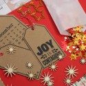
Thank you so much for joining me today!  Balance can be used in many different projects, not just scrapbooking.  But if you do create layouts, you should consider the monthly scrapbook kit - I used papers from the Season of Stars Scrapbook Kit and chipboard snowflakes from the December Mixed Media kit.  The kits are packed with coordinating papers and embellishments.

I would love to hear from you what topics you think will help you create your pages.  Please leave me a comment to let me know what you would like to see next!


4 Comments »