
Good morning everyone!
It's Anita here today to share another installment in my
Deconstructed Layout Series.

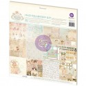
Almost every item on my layout today can be found in the Frosted Designs Store.

Have you been shopping lately?? Barb has some amazing new products in
and I am sure you will love them!!
Today I want to talk a little about perspective.
I didn't start scrapbooking until my kids were in high school. When they were babies, we didn't have digital cameras, and we didn't even have really great cameras unless you spent a fortune on them. So the majority of the photos I have from those days are not that fantastic. Most of them are not what I would take today, that is for sure! They have distracting backgrounds, they are taken from far away, I never considered the lighting-- I just took pictures. And because technology was not that great, even scanning them is not an option sometimes- they are too grainy when enlarged. The only option is to scrap them as is.
So, I only have this one little photo of my precious baby on her first bike with the training wheels. Now, I was able to scan this one in and do a little editing to it; there was a HUGE trashcan right behind her head- really- it looked like it was growing out of her head! So I was able to take that out. But it was too grainy to really blow up so I had to leave it pretty much the same size.

Now, if this was a digital photo, we would just hit delete and move on. But, this is the only one I have. So my choices are to scrap it like this or do without. In the end, I want to scrap these memories, so I'm using these photos even if they are not great. Such is life.
There are a few tricks you can use to make a photo "pop".

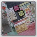
#1. Layering the photo up off the page will help the eye focus on the photo before it gets to the embellishments. For this I used a chipboard frame. Normally we would put the chipboard frame on TOP of the photos, but in this instance that was the opposite of what I wanted. As you can see above, when the photo is below the chipboard your eye focuses on the chipboard first, the photo second. When you put the photo on top of the chipboard, the eye naturally focuses on the photo first, which is what we want.
 #2. I used stickers strategically on my photo to call attention to my daughter- because she is not very big in the photo itself. If I cropped all the excess out of the photo that would leave a photo that was about 1 X 2- not nearly big enough for a layout.

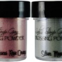
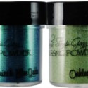
#3. I used a limited palette so I wouldn't overwhelm the eye. Even though there is color on the page, nothing really stands out. I used 3 colors of embossing powder on the chipboard frame, but it almost blends into the black background- leaving the photo floating up there on top.
If you have photos you have not yet scrapped because they are not "perfect" - it is time to get them out. There are so many ways to get those photos onto layouts. After all, it is about the memories, not a perfect photo.
Thanks for stopping by today!


4 Comments »


4 Responses to “The Deconstructed Layout With Anita”
Such a pretty layout Anita! I really love the navy background with the pops of pale pink. And the frame around your photo is gorgeous!
Anita - you have the best tips!!
This is amazing Anita! Thanks for all the great tips!
This is gorgeous! LOVING the jar and the hearts!!!
Post a Comment